top of page
Protex Rebranding
Client:
EuroM / Protex
Role:
Visual Designer
Date:
2019
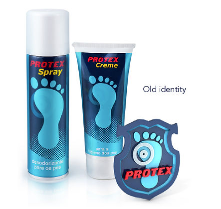
Protex is a skincare brand with a 50-year history focused on feet protection. My role was to rebrand the original concept preserving its core characteristics - the lettering, and their iconic foot.
While keeping the brand awareness and history, the new design emerged from two fundamental concepts: moisturising and freshness. Along with a modern and refreshed logo, I created a packaging set to reflect the rebranding.


bottom of page